One of the most common annoyances of designing with Claude Code is that it tends to only use half of the available space in the header section, and it sometimes can take some prompt wrestling for it to just do what should be the most obvious thing: use that empty half on the right of the screen too.
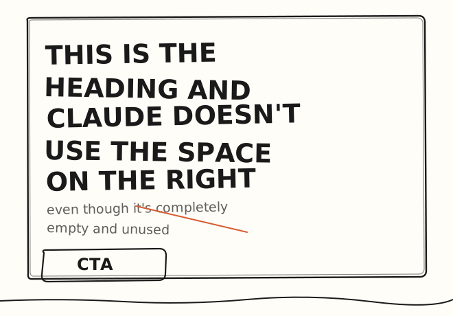
Here’s why this happens. The two-column hero is the median layout in Claude’s training data. It’s the default marketing site pattern of the web: copy on the left and then an image, a screenshot or a product shot on the right. Unless you tell Claude otherwise, it will produce the most typical thing. So it just creates this two-column scaffold and leaves the second cell empty.
And there is another reason, and that is that an actual best practice is to constrain text on the web to 60 to 75 characters, because beyond that it becomes more difficult to read on the web.
How to prevent Claude from using only half of the hero section
Tell Claude this:
never output a multi-column section where a column has no real content. The hero section must occupy the same container width as the rest of the page and must not leave more than about 15% of its horizontal area empty. Constrain body copy to approximately 65 characters for readability, but let the headline run wider.or you can just decide to go with a two-column hero section and put something in the right column. That could be an image, a book, an appointment widget, or even social proof or a video.